
This delicate new floral design began with a pencil drawing before fully blooming through hand block printing. Find out more...
Drawing
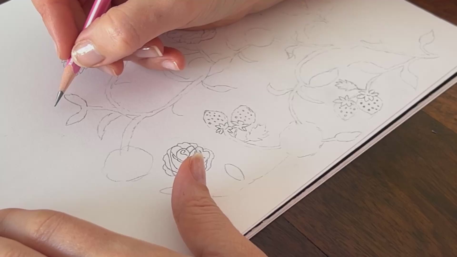
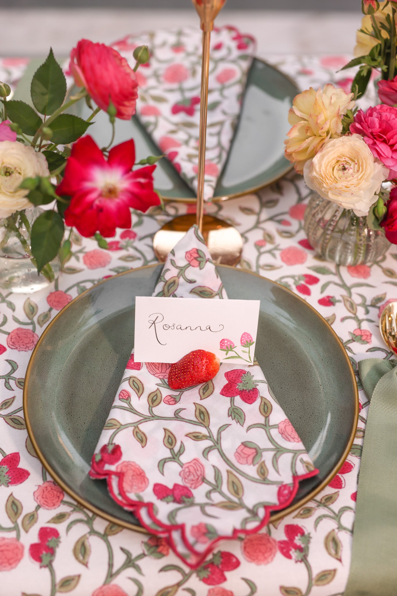
This print brings together fond memories of summers in the Cotswolds - those rare, halcyon days when the sun shines, the berries are ripe, and the roses are in full bloom. For the print, I intertwined the stalks of the strawberries and stems of the roses so that they form a repeat pattern.
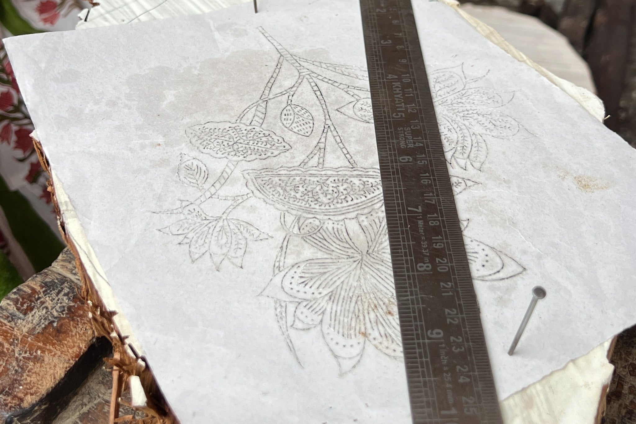
Tracing
The drawing was traced onto thin, semi-transparent paper. This is placed over the wood, and the outline is retraced with a pencil or stylus. This serves as a precise guide for carving, ensuring each element of the design will be accurately reproduced.
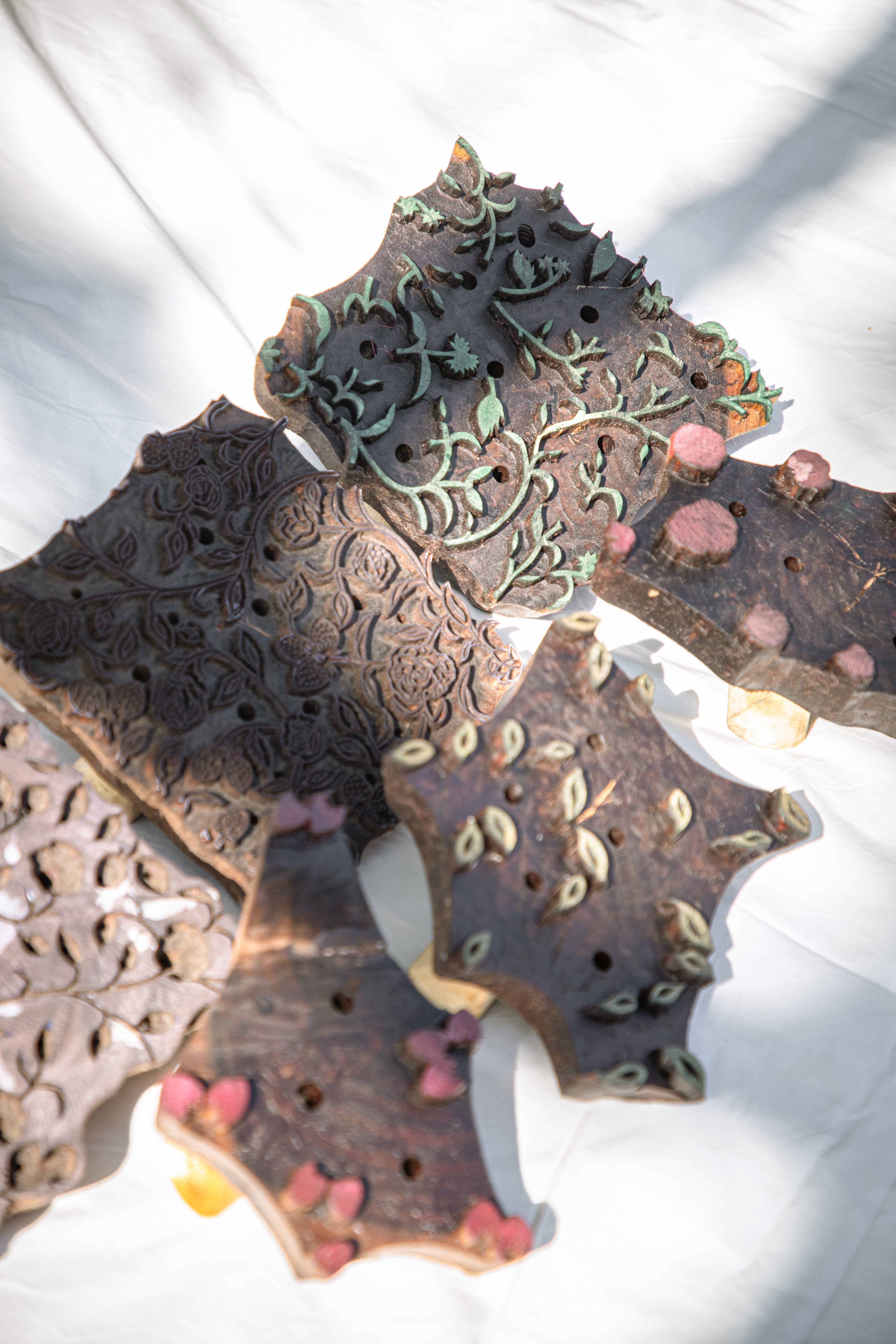
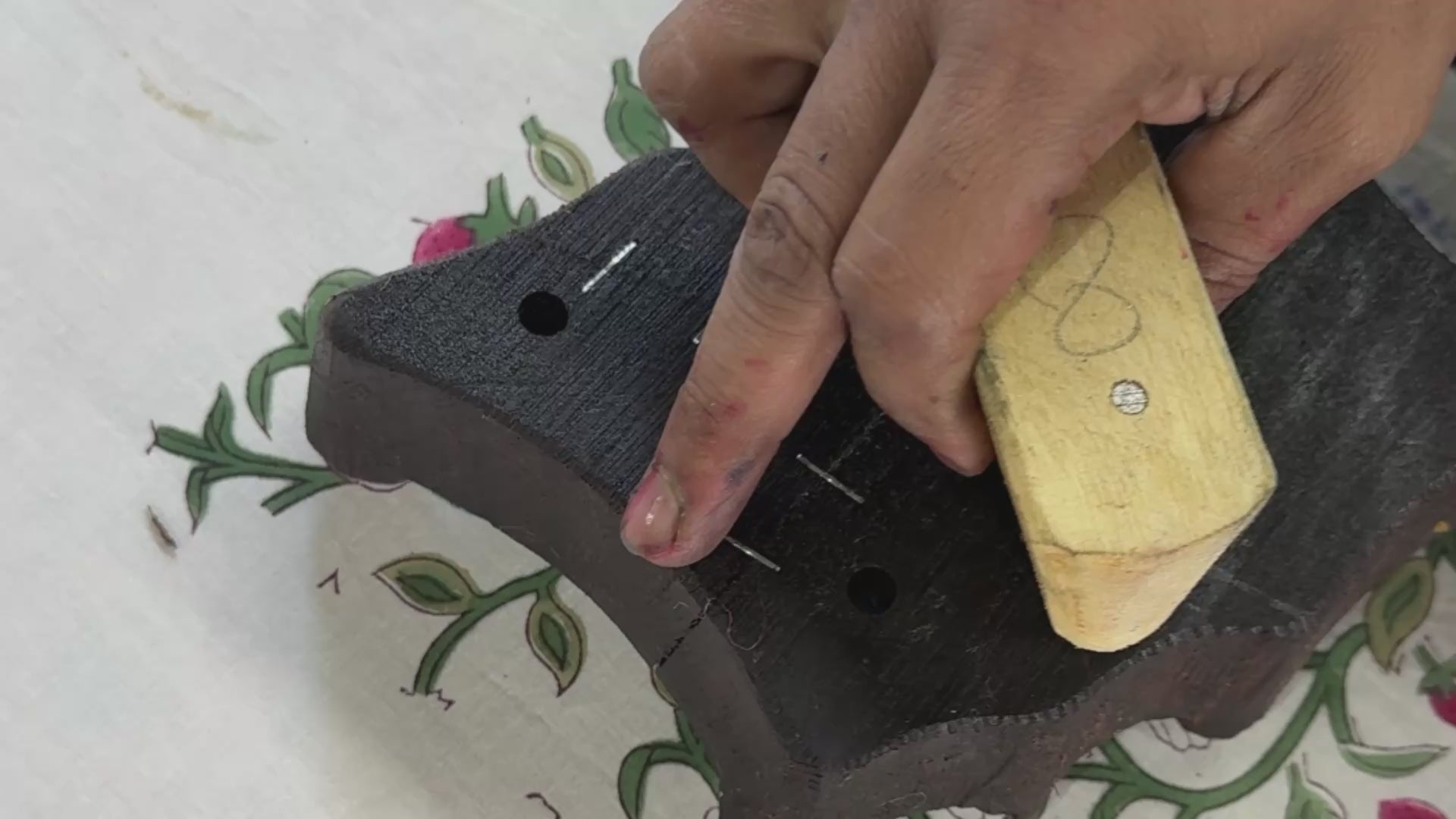
Carving
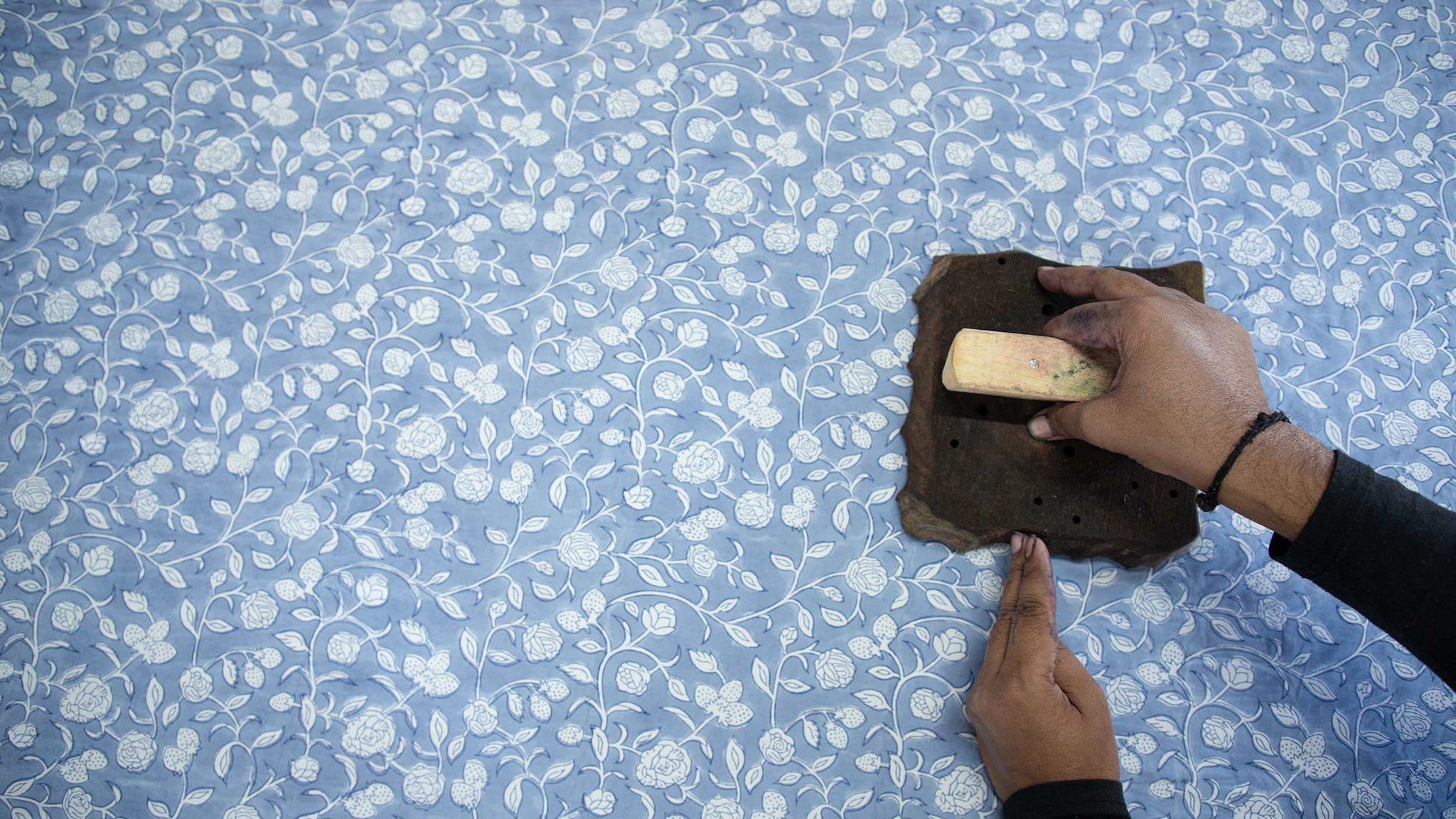
This is my first multicoloured block so it requires 6 separate wooden blocks - one for each colour and print element. Following the pencil markings, skilled artisans carve out the negative spaces to form a raised relief of the design, which will later be inked and pressed onto fabric.
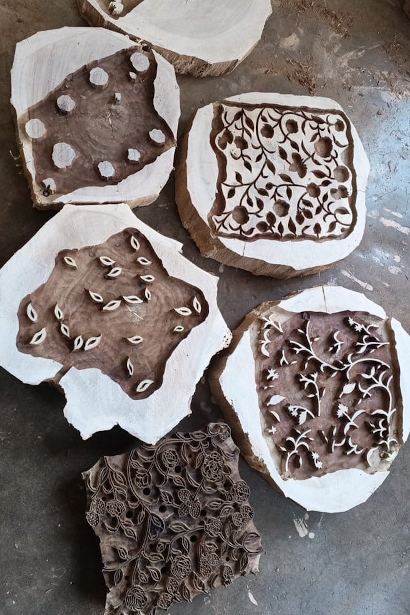
"This is our first foray into a multicoloured print with 5 colours and 6 hand-cut blocks coming together to create Roses & Berries."

Conditioning
The block is typically soaked in oil to prepare it for printing, conditioning the wood, extending its lifespan and ensuring smoother application of dye in printing. The final step before Roses & Berries are ready to print!
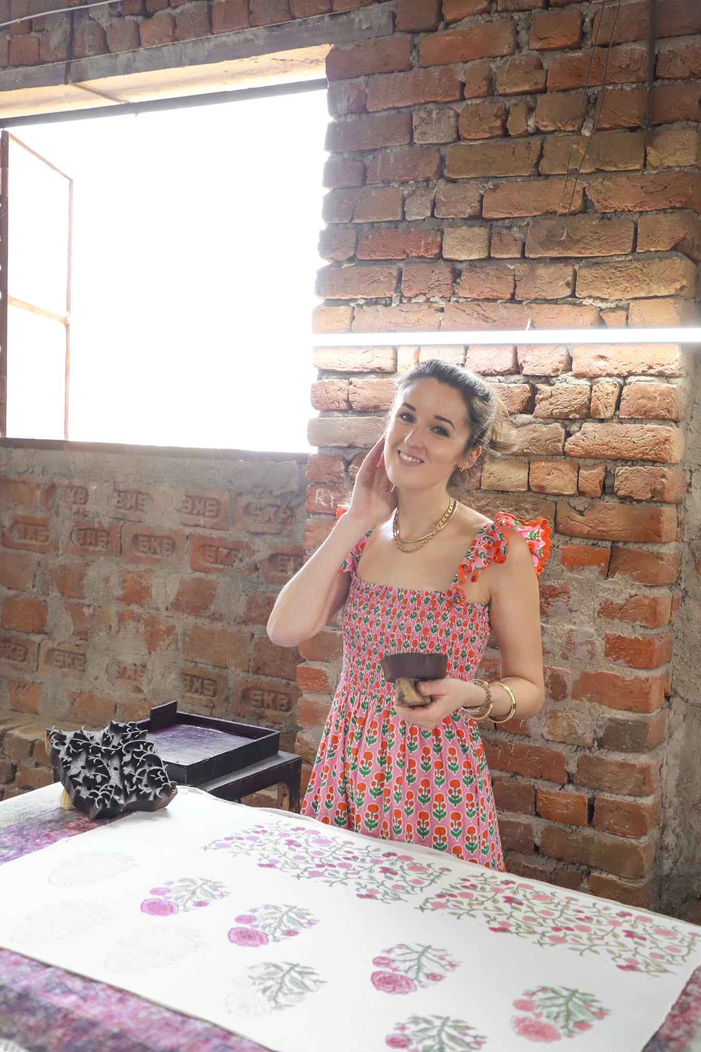
Printing
As this design combines five colours (two greens, two pink and one maroon outline) it took a long time to perfect the combination. Even after two years, I don't come close to the artisans' skill (pictured!) Artisans dip the block into dye, press it firmly onto a long table of stretched, taut cotton, and lift it off in one swift motion. They repeat this with different blocks and colors, aligning each impression meticulously to build up the final design.
Setting
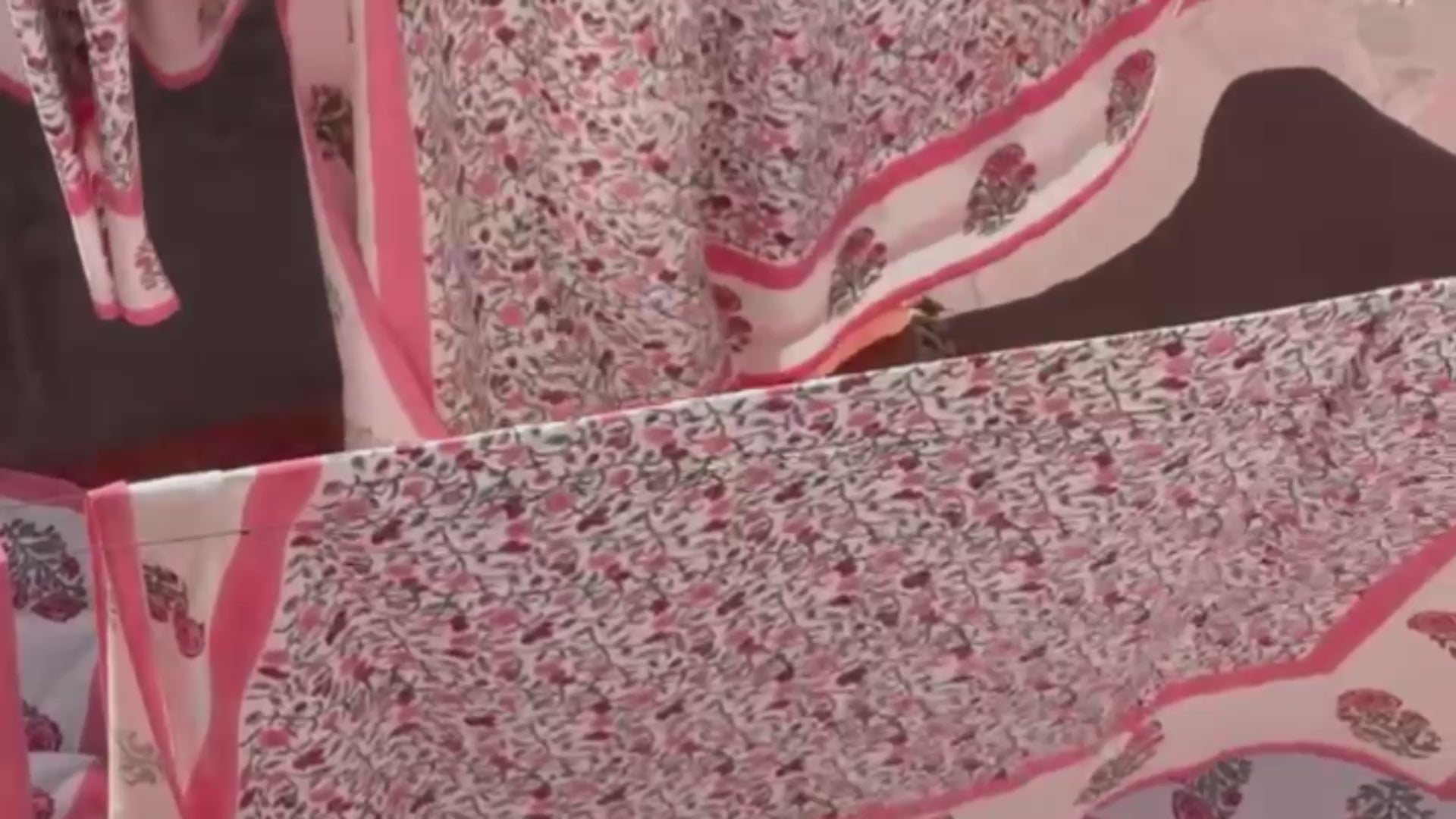
The prints are conditioned and finished with a combination of steaming, sun drying and washing. Not to mention the softness and subtle warmth this gives the colours. It's a traditional process powered by the sun and the talent of craftsmen!
Styling
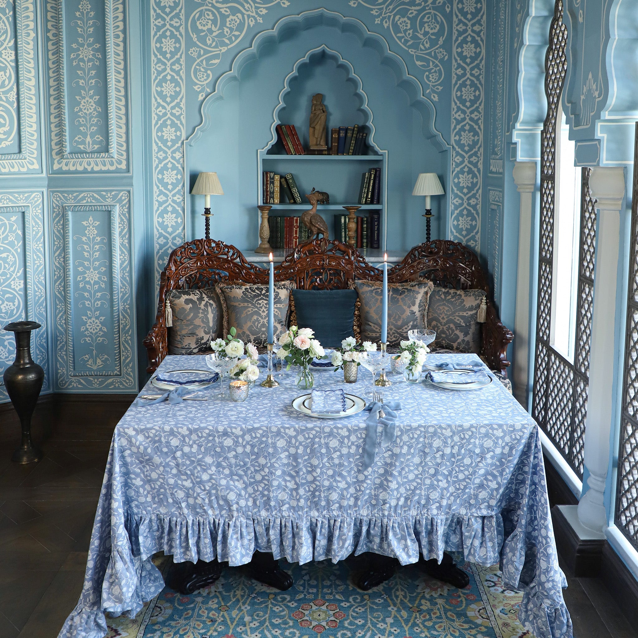
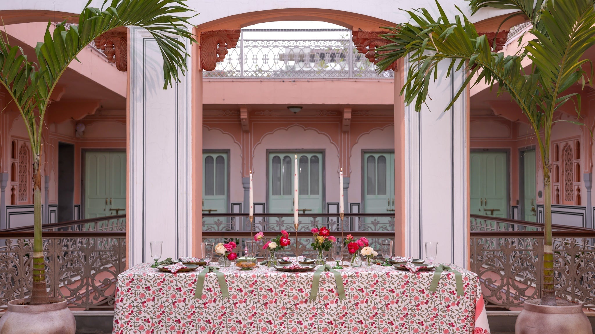
I was over the moon to discover the new Padmaa Jaipur. A 289-year-old haveli in the heart of the old city has been reimagined as a 15-room boutique hotel in shades of pink, white and green - the perfect palette to echo the print itself. Its Chandni (or moonlit courtyard) provided the ideal backdrop, with its arches framing the table.a
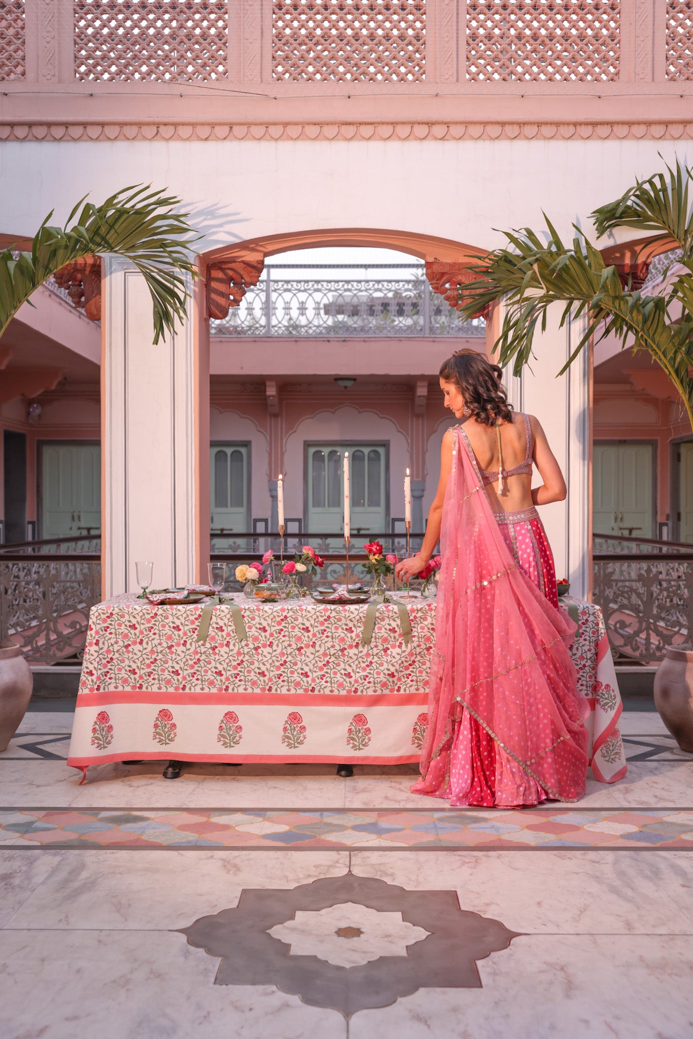
"Pink and green is my favourite combination of complementary colours. The harmonious pairing of warm pink and cool green is often found in nature, giving it balanced, refreshing appeal."


The Journal
Raffles Jaipur Tablescape
A debut for the new collection in the Writers' Bar of Raffles Jaipur.
March Lunch & Masterclass
A private lunch and masterclass with Louis Roederer commissioned by esteemed magazine 'The Wedding Edition'.
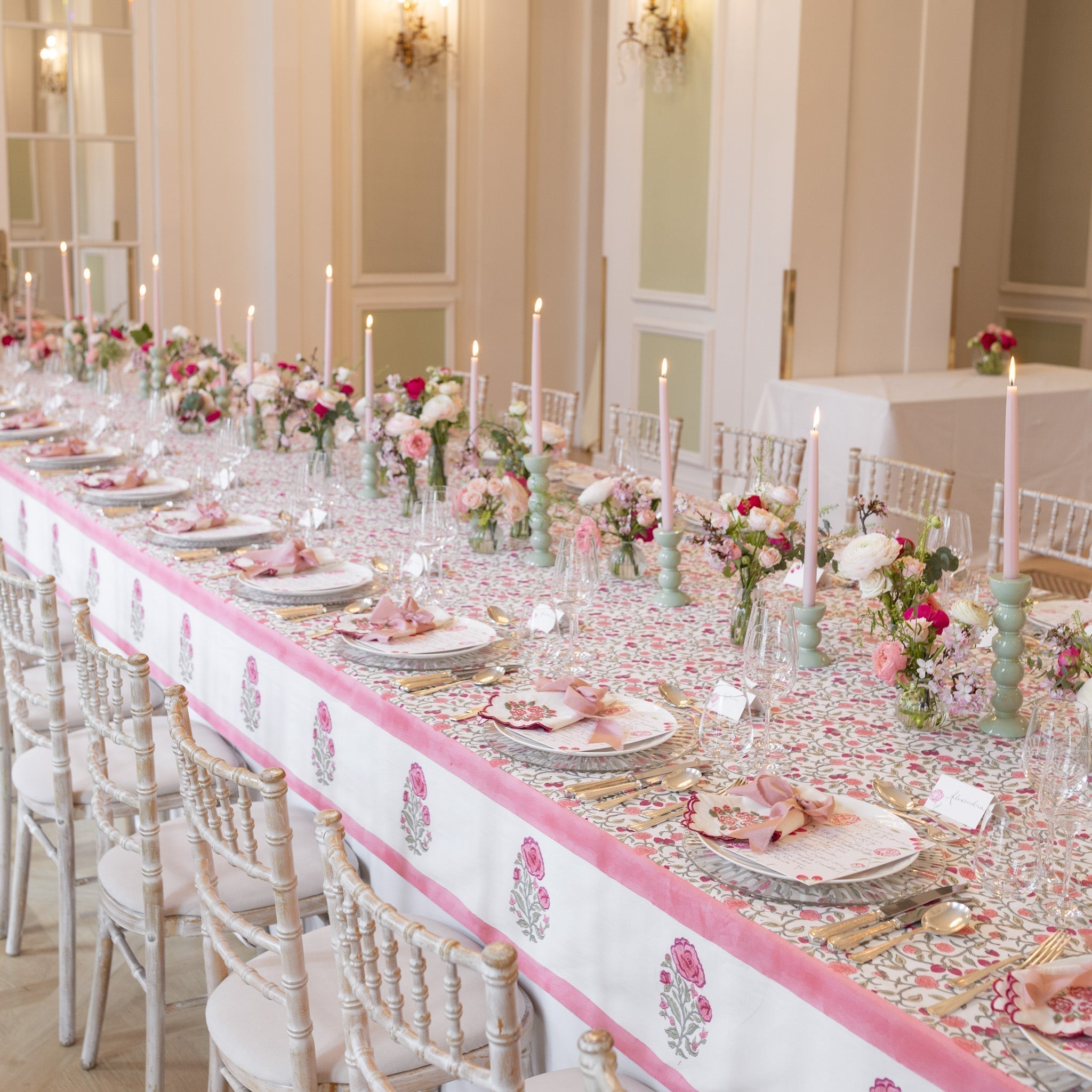
Roses Berries Tablescape
A tablescape in Rosanna's favourite colour combination at the new Padmaa hotel in Jaipur.